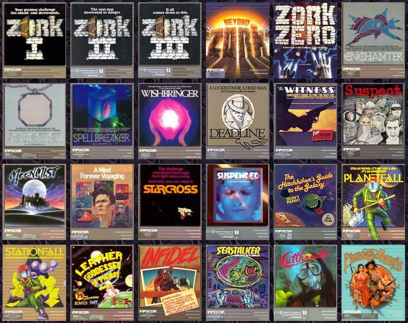
With 1984’s efforts to homogenize and systematize its packaging, early Infocom’s singular objets d’art were transformed into representations of a brand.
The GrAy Box: Business Context
At the onset of 1984, Zork games had been available for purchase for two years and one month. Those titles spent much of that time in the Softalk sales charts, and all of Infocom’s subsequent releases had made the list as well. Their games had become, undeniably, capital “B” Big, capital “B” Business. The games division did not, in fact, seem big enough–at least not for newly crowned CEO Al Vezza. Infocom’s ill-fated business product, Cornerstone, had begun sucking all of the financial oxygen out of the company as it haplessly chased a VisiCalc-level business hit of its own.
While 1984 marked Infocom’s sales peak, it’s important to note that 1980’s Zork I outsold (total sales 151,100 units) every 1984 release by a wide margin–including the blockbuster Hitchhiker’s Guide to the Galaxy (59,007 units). In fact, the rather niche CBM release of Zork I—I’m quite fond of its packaging–came close to Hitchhiker’s numbers on only one platform. Admittedly, Hitchhiker’s released in September, but by them Zork I was almost three years old (figures retrieved from these documents hosted at the Internet Archive, particularly page 20).
More important: in 1984, Infocom lost money despite its record-setting sales. In fact, it lost more money ($2.4 million) than it had ever made. Infocom would never be profitable again, but that is a story for 1985. For now, it is enough to say that Infocom had become, thanks to a new and corpulent Business Products division, a Big Company chasing Big Money. In the eyes of at least one executive, record game sales were a way to offset the cost of a new database program being made in a highly competitive market. So far as I can tell, little to no money was invested in creating new gaming technologies–Infocom began as a technical innovator, after all–and beyond occasional conveniences or new commands, there was nothing in 1984 that comes off as a product of institutional R&D.
Looking Good on Paper
That is not to say that there were no substantial innovations at Infocom that year. In fact, Infocom’s most brilliant new creation of 1984 was not a game. It was, instead, a packaging format that was friendly to retailers while enabling customers to easily recognize Infocom games–even from a distance. This new standard was carefully designed to promote brand recognition, encourage retailer shelving and displays, and tease the various feelies stored within a game box. The ever-reliable Jimmy Maher credits marketing genius and University of Chicago MBA Mike Dornbrook with spearheading the effort in collaboration with G/R Copy, who had been designing Infocom’s packaging (and naming many of their games!) for years.

What was the gray box, exactly? Spatially, it had the dimensions of a small, hardcover novel. The box was approximately 7.5″ x 9″ x 1″. The front cover opened up and left–just as a book does, and the boxes would prove to sit comfortably on the shelves of bookseller chains like Waldenbooks and B. Dalton’s. Each gray box release followed a standardized design format, as well. The front cover, in addition to title and cover art, reserved a gray, horizontal band for designating the publisher, the genre (Fantasy, Sci-Fi, Tales of Adventure, etc.) and a difficulty level. Standardized characterizations of difficulty were a new tactic, and even though Infocom’s choices didn’t always make sense (the notoriously difficult Hitchhiker’s Guide to the Galaxy was presumably listed as “Standard” difficulty to avoid scaring off customers), the principle was sound. For instance, someone ought to know before buying Deadline that it may be Infocom’s hardest game.
Most interesting, though, is Infocom’s abandonment of the “Interlogic” branding for its text games. Instead, above the genre and difficulty designations, every new release declared itself “Interactive Fiction.” This wasn’t a first, technically. The folio release of Seastalker uses the phrase. While Seastalker may have used it first (at Infocom. The term was first coined by Robert Lafore), the gray box’s iconic design, and all the games released under the gray box specification, are what made the term stick.
And stick it did, as the term remains widely used to this day.

In addition to the ingenious decision to deliver their games in a book-like form factor, Infocom went further and included a booklet with each game that customers could browse in-store. This content, called a “browsie,” was generally well-produced and appealing. There must be many purchases that can be credited to this practice. Further emphasizing the unique physicality of Infocom games, a clear, plastic window in the back of the “book” revealed packed in “feelies” and other materials.

Don’t Look Back
I’ve used the word “iconic” to characterize this standardized packaging format. Collectors and enthusiasts continue to have very positive associations with it. In fact, I nearly used the non-word “blorple” (a magic spell from Spellbreaker) in tandem with “gray box” to brand this very website. Even ignoring storage needs, this new format afforded customers some advantages. For one thing, it committed Infocom to providing browsie material and feelies for every new and rereleased game. Additionally, it made it easy to find Infocom games (in multiple senses of the word) in stores. Finally, the difficulty designation was a customer-friendly move (though perhaps the ratings themselves baffle in some cases).
Ultimately, though, this was a material decision by a company whose folio products–excepting the Zork trilogy–were famously material. In two instances–Starcross and Suspended–Infocom games were manifestations and promises of cerebral spectacle. With their plastic packages that stymied retail shelving or display, these games were art objects that physically resisted their own commodification. In other cases, feelies were seemingly buoyed and birthed by authorial joy. The Infotater bundled with Sorcerer is one such lovable extravagance.
Reprinting the old folios in the new, standard format was, unfortunately, an impoverishment. Deadline’s stunning file folder became a printed texture on the browsie’s slick, magazine-style paper. Its authentic-feeling papers were robbed of their individual textures, and the realistic, legal-sized paper used for suspect interviews was forsaken for a browsie-sized, double-column format.
Sometimes the original meaning or framing context of these “classic” Infocom games was changed, and not always for the better. A persistent characteristic of the gray box rereleases is a heavy emphasis on (or perhaps it is a thwarted desire for) humor of an insistent, nyuk nyuk nyuk sort. The incredibly austere Starcross was “enhanced” to include a rather silly journal written by the protagonist. By the end of the game, the star of Starcross has proven themselves brilliant and resourceful, but they didn’t write a brilliant person’s diary. The pitch-perfect tone of Suspended was disrupted by bizarre jokes that seemingly came from nowhere.
Most egregiously, the Zork trilogy reissues, which were originally published with only a brief (the sole item accompanying the original Apple II release of Zork I is a manual of only ten pages) were significantly retconned. For the sole purpose of filling a browsie, countless factoids and historical bric-a-brac were invented out of nothing. They did not enlarge the experiences of the games they represented and often seem to have mistaken silliness for humor. The Zork games, whose sales built and sustained Infocom, were sold for years without any sort of supplemental packaging, and the new materials created more problems–in terms of in-universe lore–than they possibly could have solved.

One Box to Rule Them All
As well as we remember the gray box, it was not a consumer-centered move. It was, rather, an ingenious effort to consolidate packing in order to facilitate shipping, shelving, and brand recognition. It worked very well. Anyone from those days can easily identify any Infocom game published between mid-1984 and early 1987 (Stationfall was the first game to be published in the “post-gray box” format), even if, all told, that period represents just three of Infocom’s nine years. Furthermore, the new browsie format unquestionably snared more than a few shoppers (I count myself among them). Finally, the book-like format encouraged the sale of Infocom’s games in stores that did not traditionally feature game software, most notably bookstores.
It’s hard, though, looking back, to avoid seeing this development as a commodification. After all, Infocom, in terms of total investment and expense, was no longer a game company. It had become a business software company that made games. This shift in terms of managerial and financial focus fomented an environment where games were considered, at the executive level, as widgets first and games second. Each folio release, by contrast, asserted its own uniqueness, and brazenly demanded that vendors find a way to get it on their shelves. Even Zork‘s minimalist packaging was, in its own way, perfectly suited to the isolate worlds it fictionalized. Standardization was a shrewd business move and, regrettably, “business” would prove to be Infocom’s white whale.
Believe It or not, This Is a Cutthroats Post
The first game released in the gray box format was, of course, Mike Berlyn’s Cutthroats. Speaking of bum packaging: can anyone tell me how Mike Berlyn, science fantasist and the genius behind Suspended, became the sole owner and proprietor of Infocom’s “Tales of Adventure” brand? Berlyn, seemingly cowed by hostile reactions to Infidel‘s provocative ending, followed up with the safer–and less interesting–Cutthroats. More to come Monday!


Leave a Reply